
Designing a Deluxe Kit
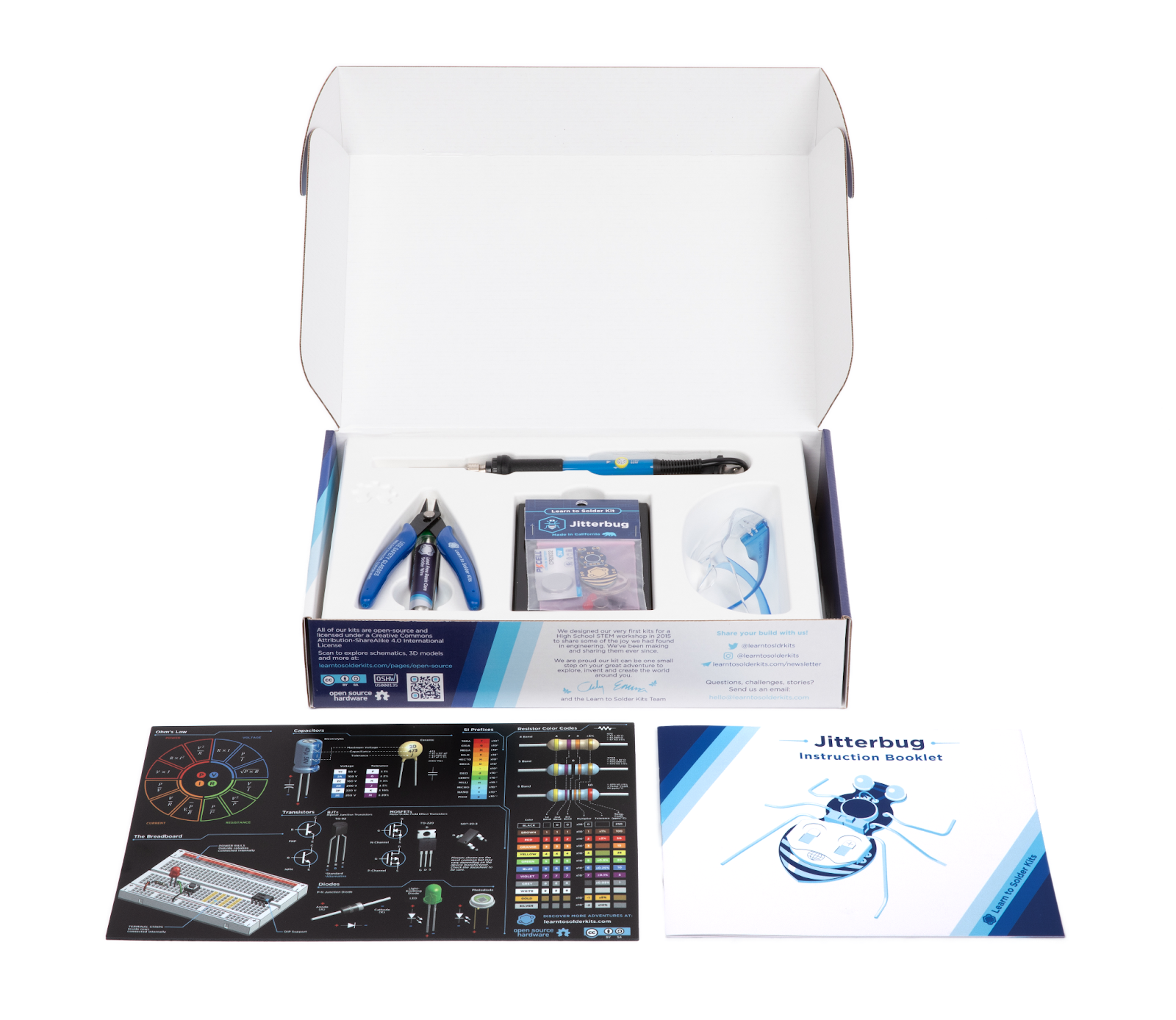
So a little while back we took some time to put together a "Deluxe Kit" inclusive of all the things a person would need to build one of our projects and embark on their journey into electronics.
I thought I'd share some of the hundreds of usually invisible decisions that go into bringing anything, no matter how small into existence. Here are some of the messy thoughts, learnings, missteps and detours we took on the path of making this humble little box of tools, a reality.
Molded Insert
The reason it took us awhile to introduce our Deluxe Kit was largely because we didn't want to sell a product where everything was just crammed haphazardly into a box. So the first problem to solve was the internal packaging. There are people who are legitimate packaging engineers so all of this is just me dipping my toes into a new world and trying to figure things out. Here are a few of the options we explored:
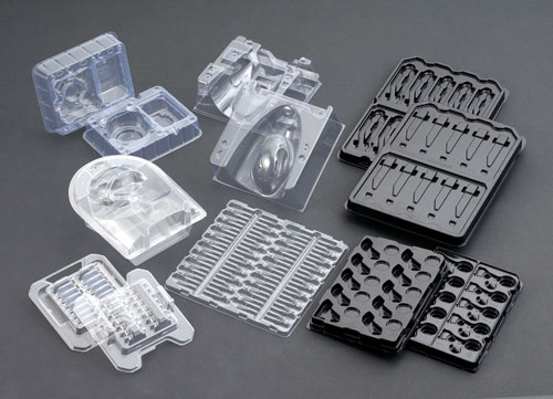
Vacuum-formed plastic
This is the direction packaging suppliers were pushing us towards when I explained what we wanted. It’s pretty economical, and we could design something cool and custom for our parts to slot into. But, the feel of it is a little bit cheaper, and I didn’t love the idea of adding more single-use plastic to the world.
Custom Cut Foam Inserts
These come in two main types: open-cell foam (would get soggy if you got them wet) and closed-cell foam (wouldn’t). Both are pretty premium looking but, unlike other options, foam won’t nest together or fold flat. Since we do all our assembly in house, this means we’d have to find a place to put like 1000-2000 blocks of foam. For us that would have meant renting out extra space just to store them.
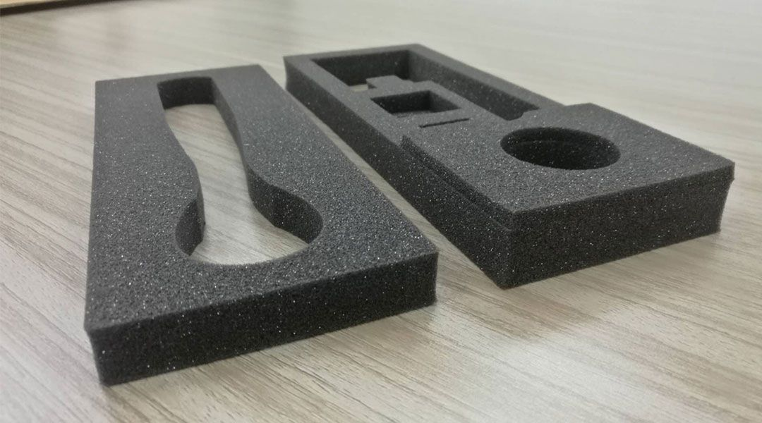
I never got a formal quote, but I got the impression that these would also be rather cost prohibitive. As environmental impact goes, my guess is that these would use about as much, maybe more material than vacuumed plastic and would be even less likely to ever be recycled.
Mushrooms?!
I ran across this option, Mushroom Packaging. It’s a little out there but hear me out. It's produced by mixing hemp fibers and mycelium in a mold and allowing it to grow for a week. When it’s done, they dry it out, and it becomes something like a natural, biodegradable, styrofoam. It’s shelf stable for a few decades, but if you toss it in a compost bin where it’s exposed to moisture, it returns to the earth - hella cool.
The finish is a little bit rough and these still have the volumetric problem that foam does in taking up a lot of storage space. But, unlike foam and the other packaging materials, where you’re expected to buy in large quantities to justify the labor of the machine setup, these are being slowly, constantly grown for you. So instead of a big shipment once or twice a year that you need to find a place to store, these would get delivered in many smaller just-in-time shipments. This is great for a million reasons - less storage space taken up, no huge purchases messing up your company’s cash flow, etc, etc.
The design constraints - draft angles, feature size, etc. are actually pretty similar to what we ultimately found with molded pulp (and is probably pretty similar to those of vacuum-forming).
The tooling cost is also pretty reasonable. But it requires a minimum of 10k units per year and we were not projecting anywhere close to that for our new, untested product. But I really hope this becomes a more popular option for people and I want to try and find a use case for it at some point in the future.
Folded Cardboard
This would involve the interesting challenge of designing something using cutouts and/or clever origami folds to hold parts in place. Everything would be 100% cardboard and easily recycled together. It also has the advantage of not requiring an upfront tooling cost.

I’ve been playing around with this idea for possibly packaging one of our new soldering irons and solder stands together without a kit (for hobby stores, etc). Don’t judge the design too harshly, it’s still a concept and work in progress.
The plan for this is to add a front with a window cut out so you can see/touch the control knob, switch and silicone grip when it’s sitting on a shelf. For the Deluxe Kit though, getting the origami right seemed about an order of magnitude more difficult and it also wasn't quite the feel I wanted for the Kit.

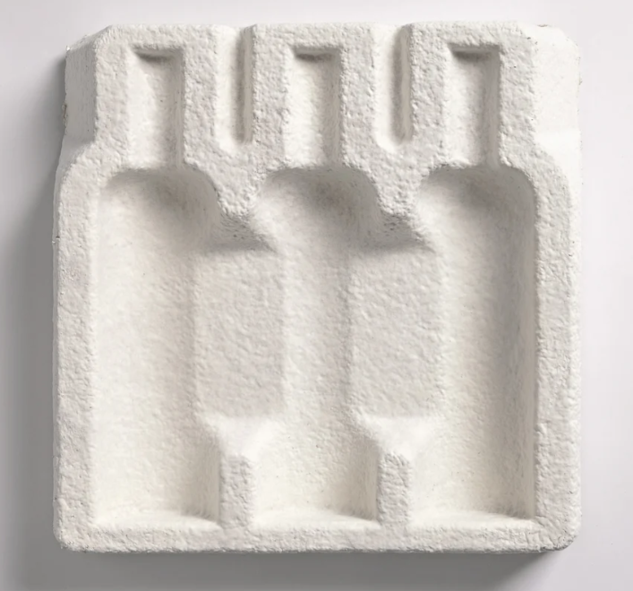
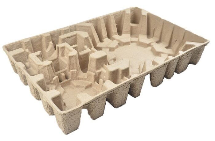
Molded Pulp
This is the direction we ended up going. It’s very similar to vacuum formed plastic but, while costing a bit more, it has none of its drawbacks. It’s biodegradable, recyclable with cardboard, is super environmentally friendly to produce and can have a really nice, high-quality feel.
Molded pulp comes in two types: wet pulp and dry pulp.
Dry Pulp is usually brown or grey and made of recycled cardboard. It’s a bit cheaper to make and tool but has a rougher finish. It’s usually used mostly structurally. You can find it protecting things as heavy as engine parts and appliances or as fragile as eggs.
Wet pulp adds water in the manufacturing process to achieve a much smoother finish. And instead of cardboard, it uses fibers from agricultural waste called bagasse, usually from sugarcane but sometimes sorghum. 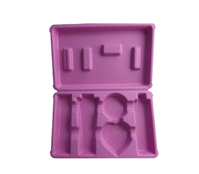
Designing for Molded Pulp
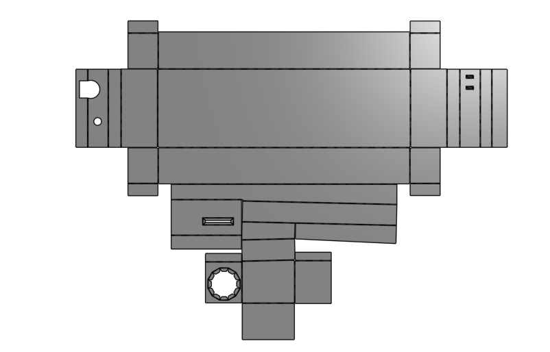
When we decided this was the direction we probably wanted to go, I went to work sourcing all the parts that were going to be in the Deluxe Kit. These would drive the shape of the mold. We got samples and I put calipers on each of them and modeled them up in Onshape.
Once I had a digital collection of the tools that were going in the kit, I went about arranging everything in 3D how I wanted the parts to be presented. Then I modeled the insert in-context around the parts. Here is the link to the finished model for the curious.
Measuring things with calipers can have limitations especially when the object has curves and draft angles (injection molded parts, etc). So sometimes I just take a few photos, scale them to measurements I do feel confident with, and… wing it. You have to be comfortable with a little more error than usual (say ± 1 or 2 mm) but for me that’s often much preferable to working with 3D scan data. Also, we don’t have a 3D scanner which complicates that approach.
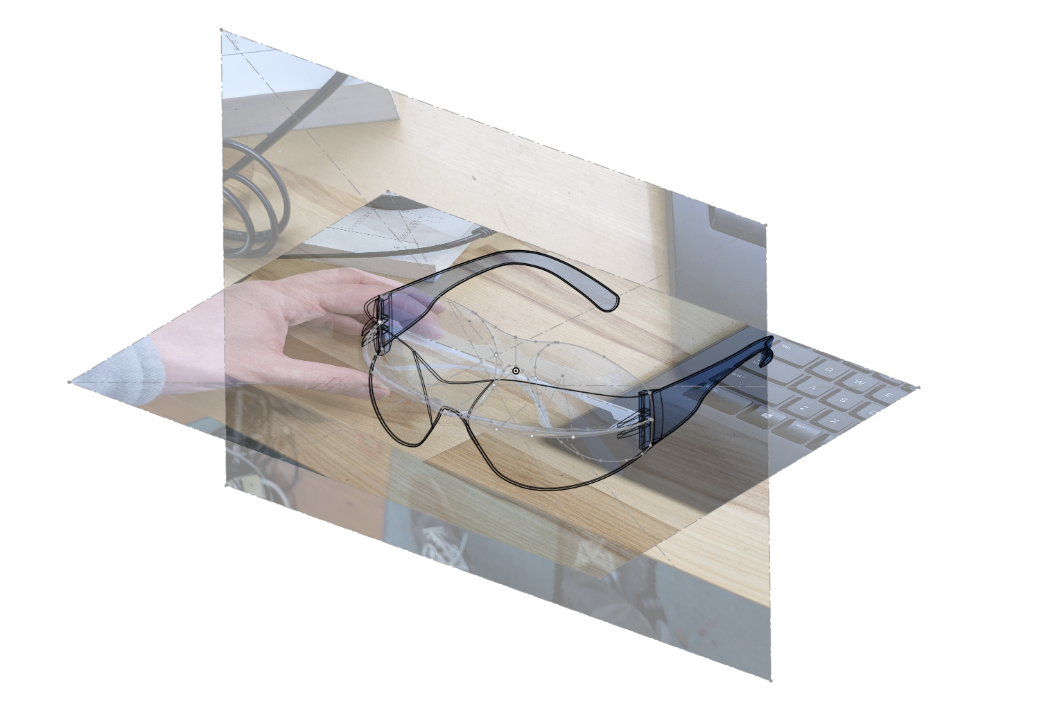
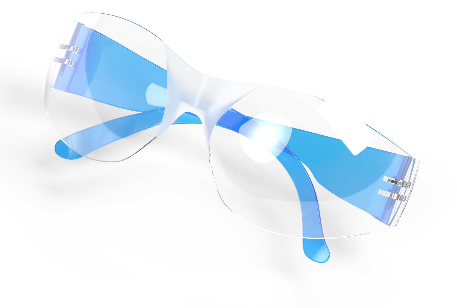
This model for the safety goggles mostly used 2D sketches and “Project Curve” with a few other surface modeling tools to get a reasonably accurate base model. There is something I find oddly soothing about the process of taking something from the real world and making it digital.
With injection molding, there are tons of design resources and white papers. Fabs will even send you free desk toys to play with in order to keep you from designing things that they won’t be able to manufacture. I have a small collection of these.
But, I could find zero documentation on manufacturability guidelines for making something out of molded pulp. My guess is that a lot of companies make a decent chunk of their fee on the design side so they want to keep the process a closely guarded secret.
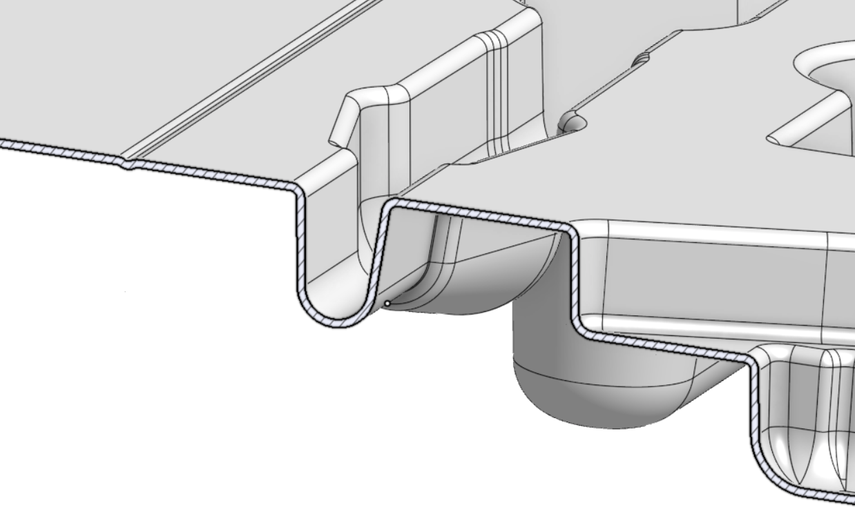
I used my best judgement guessing what the constraints might be and hoped the feedback we got before production would be minor and easily addressed. For instance, in order that the finished parts would nest together when stacked, and so that our insert would pop easily out of whatever tool was used to make it, I added a draft angle.
While CAD is all well and good, nothing beats a prototype. We 3D printed the model (with some modifications) and test fit all the components. Success.

Quoting in the US
3D printed insert and parts in hand, I went to chat with some local packaging suppliers who explicitly advertised molded pulp on their websites.
The few people I talked to locally said the same things:
-
It would be easier to do the insert out of plastic, just do that - Pssh don’t tell me what to do
-
They could get my insert made out of molded pulp but that’s not really their business - they would have to work with their supplier overseas
-
To get it made they would need to charge me a one time design and tooling fee
They gave us formal quotes for making it out of plastic (we didn’t ask). These started at $12k for the capital investment plus an initial MOQ anywhere from 5k to 50k pieces at about $1 each. Nobody ever gave us a formal quote for molded pulp but said the design fee would be at least $20k with a larger per part cost and a similar minimum order - ooof
Having already done the design, I wasn’t super inclined to pay a design fee. And since it was going to be tooled and made overseas regardless, I decided that it was better we handle that ourselves rather than play a marked-up game of telephone.
The product coming from overseas does add carbon to the lifecycle of the packaging but after some back-of-the-envelope estimating, it still seemed a substantially better option for the earth than making it out of plastic.
RFQ Overseas
So I tried a RFQ (request for quotation) on Alibaba and we got an overwhelming number of responses. The first quote was without exception, a nonsense lowball quote.
But after talking and sharing the design files, all the quotes seemed to converge around the same prices. For the rougher, dry-press inserts, the quotes were $0.60-$0.90 / unit with tooling starting at $2k. For the nicer wet press it was $1.20 - $1.75 / unit, tooling started at $4k.
I mostly picked a supplier based on the lowest MOQ and who was easiest to deal with (slash didn’t keep calling me “Bro”). Despite her profile pic seeming obviously AI generated (seemingly using the prompt “Asian Slytherin Student”) Rosy struck me as the most trustworthy.
They said a prototype mold would cost $1800 and they recommended we skip that step and risk it. Since we were pretty happy with the 3D Print, we concurred.
We paid $4k in tooling with an initial order of 1500 units at $1.22/ea to the Dongguan Lvxin Packaging Technology Co., Ltd.
DFM (Design for Manufacturing) Feedback
After I sent them the design, they gave us a small set of changes to make the insert more manufacturable.
They highlighted a few areas that were too narrow and needed updating.
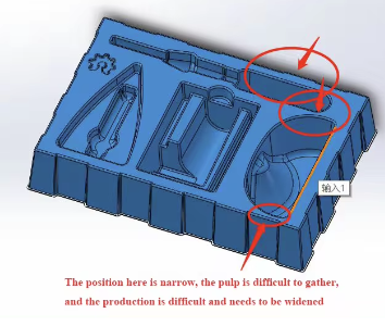
Around the skirt of the insert I had added some castellated edges (I'm making up this term/borrowing it from printed circuit boards). This is what I had seen on some similar vacuum-formed plastic inserts. Presumably they’re to help hold things inside a box and add a bit of strength. China did not like these though and suggested their more standard solution of edges that fold down. They told me they could do my option but this change would save a substantial amount of money - no argument from me.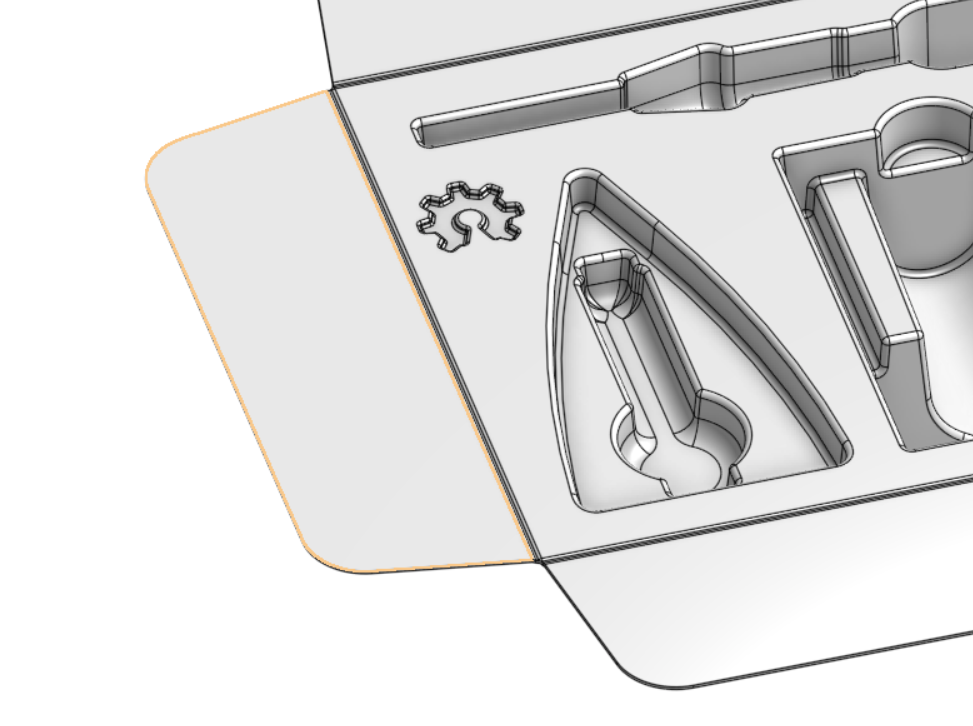

Rosy even shared videos of her college graduation ceremony with me and the hot pot she had for her birthday. I assume part of their job is to try and bond with their customers but I'd be lying if I said there wasn't something kind of fun about the cultural exchange and sharing holiday wishes with your Chinese pen pals.
As with any process, at the end, you wind up with a list of things you might have done differently.
Tariffs
In retrospect, I might have thought harder about a potential supplier in Vietnam. They wanted us to start with much too large of an initial order so it wasn’t super feasible. But they argued that we would be much less likely to deal with any tariff issues… They were right about this and we’re currently holding off on any reorders of our inserts hoping the current tariff tantrum blows over.
If these ~150% tariffs last more than a few more months, it is possible we’ll have to just end this product line - what a boon for American manufacturing and innovation.
Design
Also I wish I had been a little more extreme with the draft angle. If anyone is thinking of going through this process, I’d recommend a draft angle of at least 3-5°
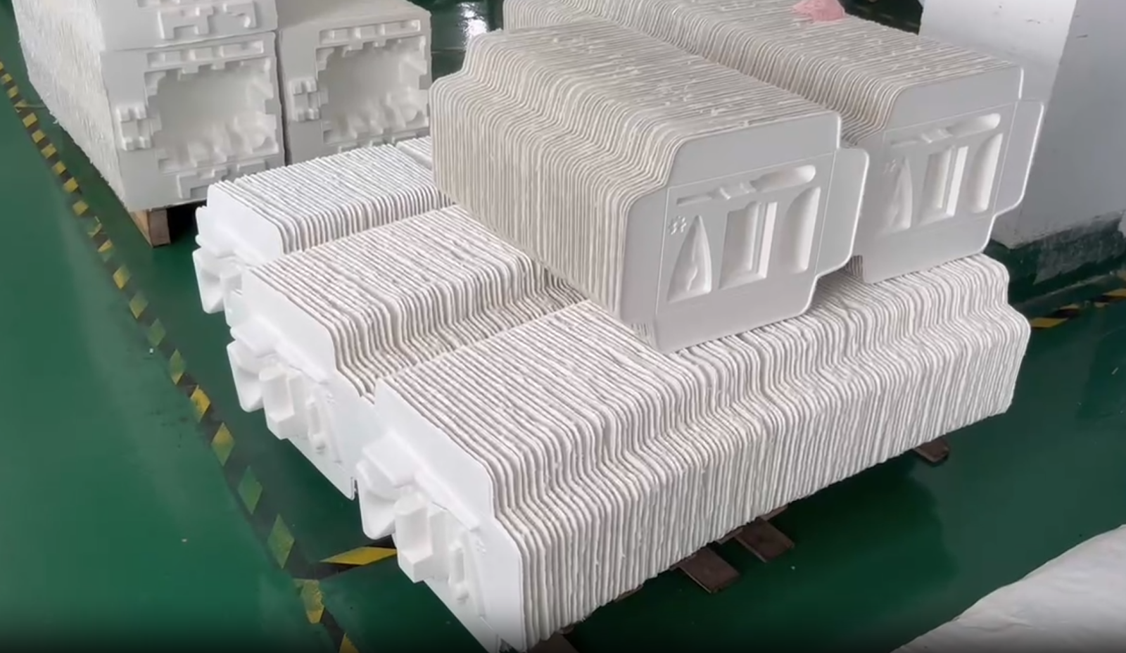
Our smallest draft angle is ~2.5° around the tip of the soldering iron. This is where the inserts tend to stick when you're pulling them apart and it’s the limiting factor on how tightly they can stack.
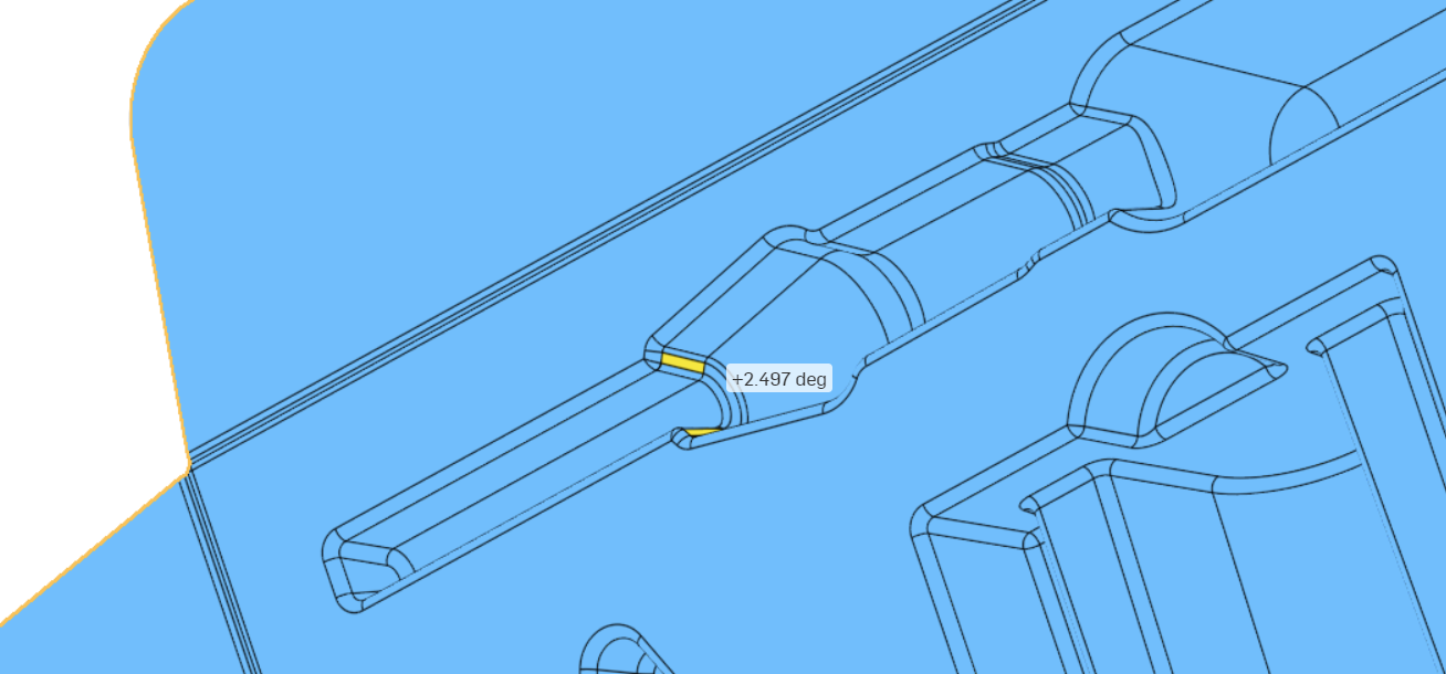
As it is, they don't stack as tightly as I would like. Here’s a picture of them partway through their manufacturing process. A larger draft angle would have reduced the storage space they take up and probably saved us a fair bit of money on the shipping costs.
Also, the fit for everything else is great but I wish I had made things a little tighter around the wire snips. They have a little bit more room than I’d like to wiggle around. But there is almost always one of two things like this that nag at you any time you spend money on a tool you can't change.
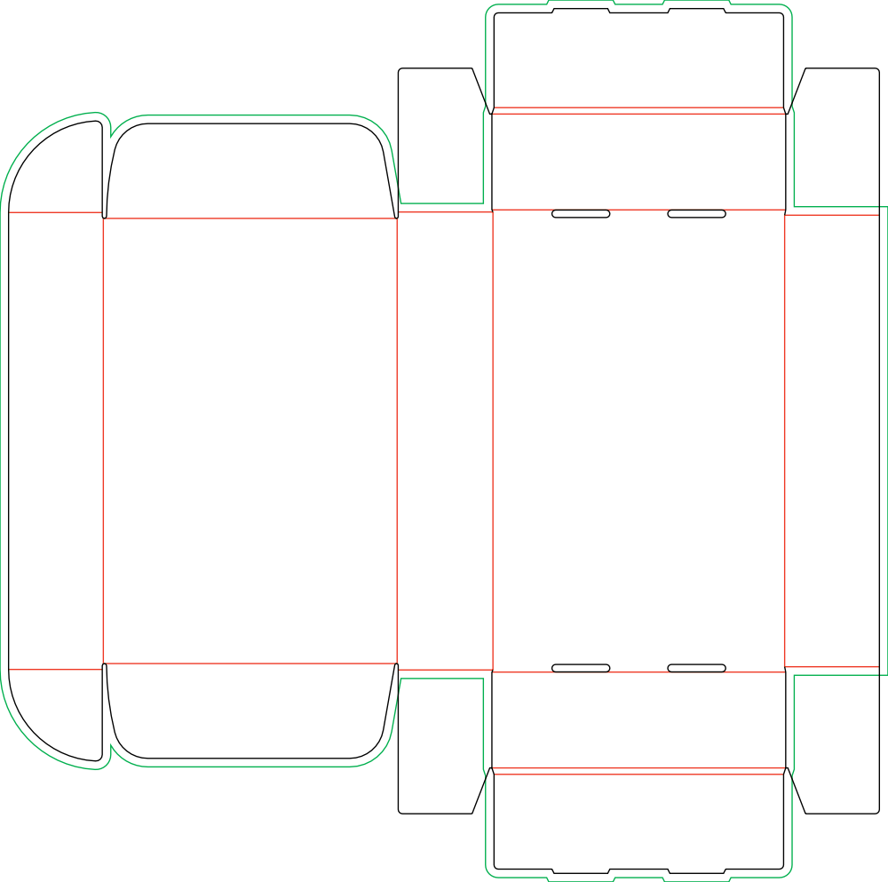
Once we had worked out the size of the insert and the box it was going in, we uploaded the internal dimensions to an online box supplier Packlane (great for low volumes and prototypes, too expensive for full scale production) and received a dieline to get started on what the packing will look like.
Box Artwork
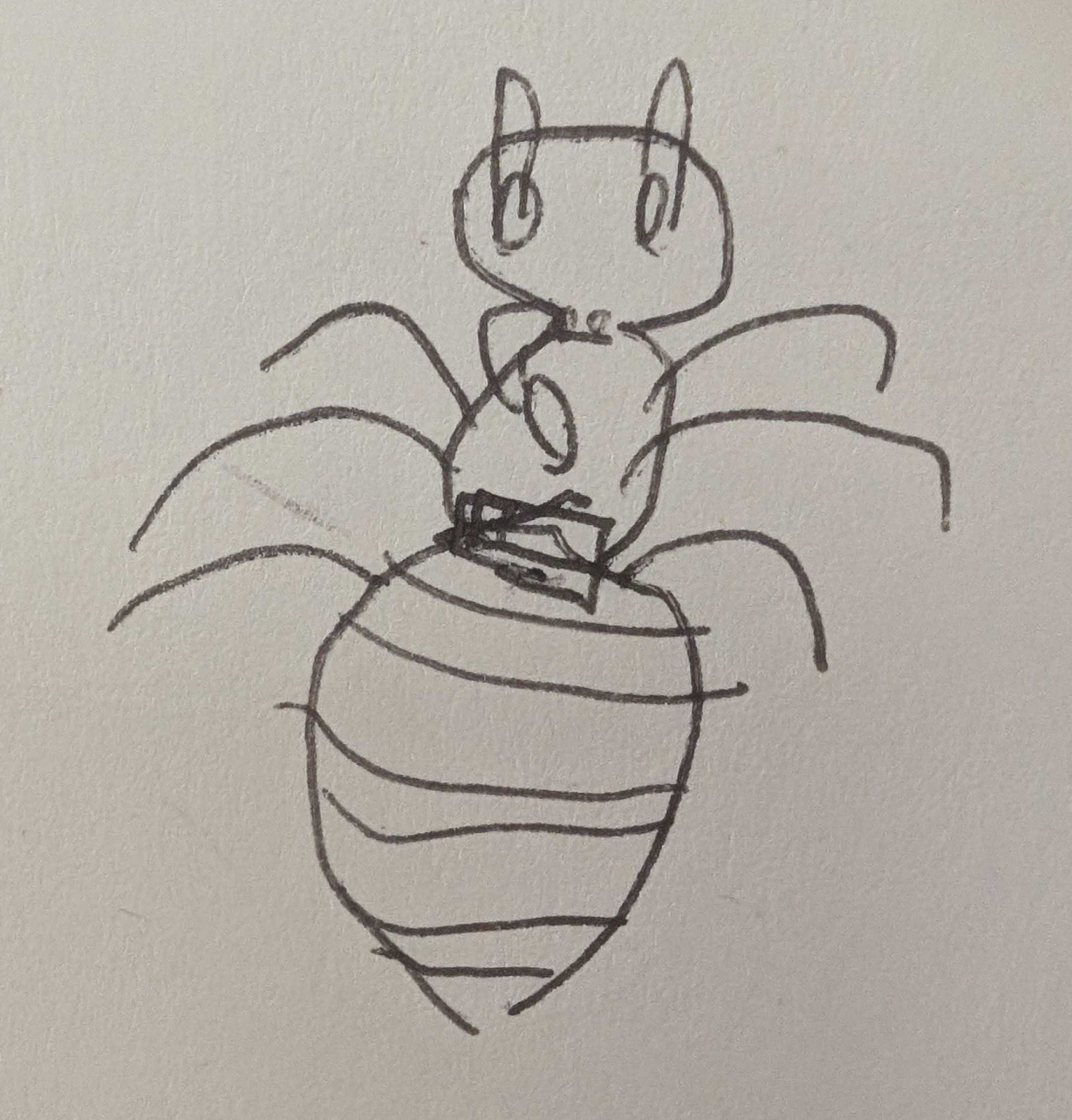
We often get emails and letters from people who buy our kits. Sometimes we’ll get a picture of a father teaching their daughter to solder while dressed up in a pink princess outfit and oversized safety goggles. Other times it’s a mother and her son. Occasionally, a note will come with a student’s messy handwriting or even this badass drawing of a Jitterbug.
We got one message from a man who wrote that he had grown up hanging around his grandfather's garage watching him solder and tinker and fix things. His grandfather had passed and he had bought our kit and put it together to feel close to him again.
I was thinking about this letter when I started trying to work out how we wanted this kit to look.
Soldering is a skill that is often multigenerational. Sometimes it involves this arcane bit of knowledge being passed with care and encouragement from one generation to the next. Other times, the adult is just as lost as the student and they learn and make mistakes together.
I wanted to try to design a box that felt appropriately nostalgic - something that would help people remember the smell of their grandfather’s workshop, or throw them back in time to where they could hear the pops and feel the excitement as a newly fixed transistor radio buzzed back to life.
I’m not sure a box can really do that. And I'm still not sure if that’s what makes the product leap off a shelf. But if you’re designing something (and want to get it done), it helps to be designing it a little for yourself.
Before getting started, Emma and I took a couple of trips to see STEM kits in the wild for inspiration. We stopped by a number of book stores along with the gift shop at the Exploratorium on Pier 15 in San Francisco, which has stocked our kits for a few years now.
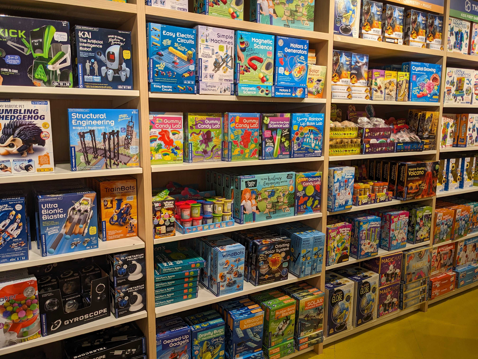
There is a lot of color and diversity in STEM kits. But we wanted ours to feel a little more adult so that (1) soldering as an activity would be taken seriously and (2) both teens and adults would feel comfortable picking up our kits.
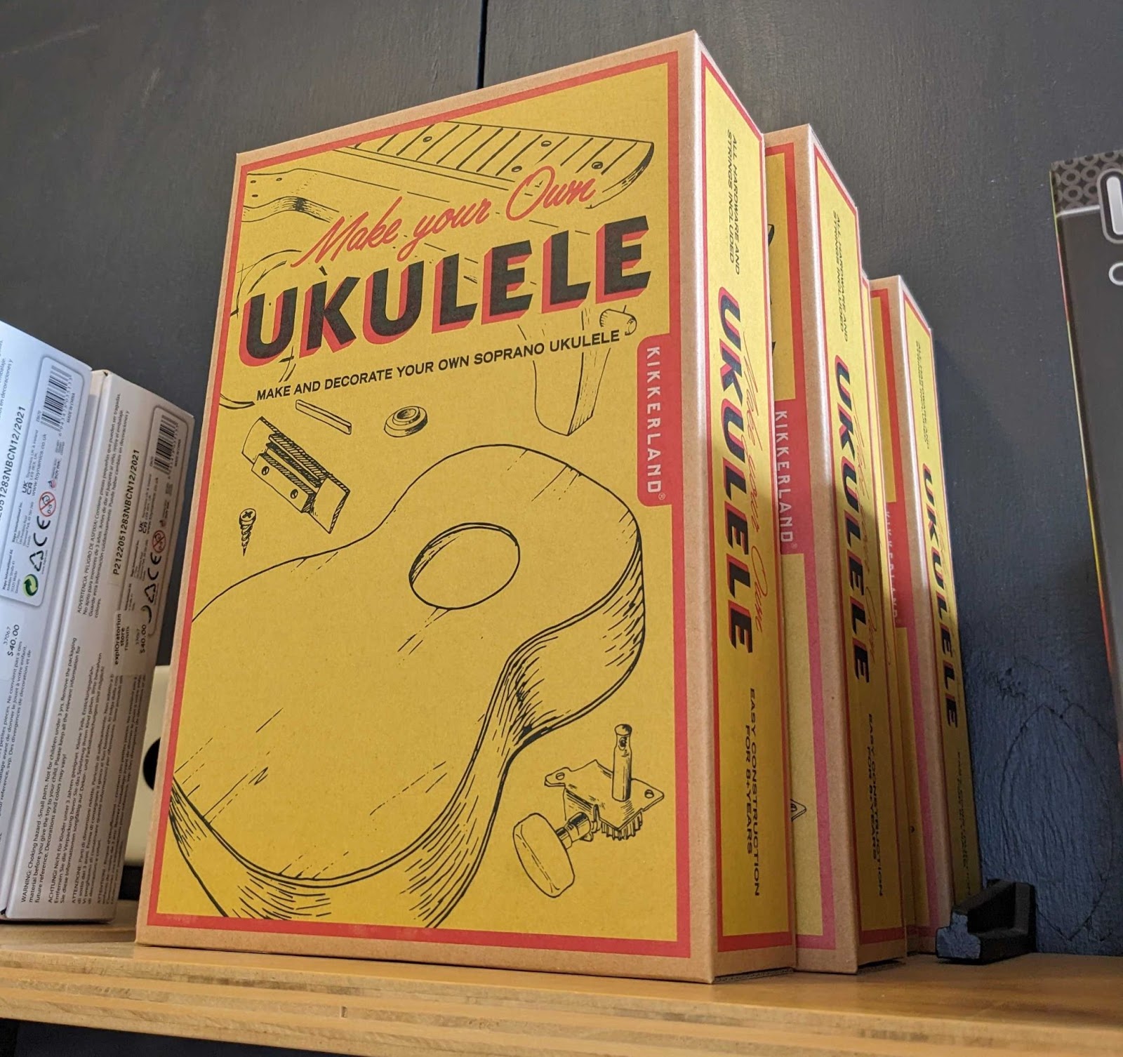
A few products we ran into at the Exploratorium, from a company in Germany, had a matte, nostalgia look I really liked which I wanted to replicate. Maybe not the exact style, but the vibe felt right. I've heard packaging people call this "Eco-Chic."

Now we were at the point where we had a clear design brief. If we were other people (and could afford it), this is where you hire a graphic designer. But we’re scrappy DIY makers, so I thought I’d try and design the box myself.
One minor obstacle to the process - I'm not a graphic designer and I had no idea how to design a box.
But having no idea how to do something doesn’t mean you shouldn’t try. The first step in the process of being good at anything is to spend awhile being pretty bad at it. I downloaded Affinity Designer (it’s like Adobe Illustrator but with a much cheaper, one-time license fee).
The color of our branding has always bluish. Messing around, I stacked four shades of blue in a gradient which immediately felt right. It gave off what felt to me like a funky ‘70s vibe.
For the rest of the packaging, one thing we knew we didn’t want was photography of some happy person soldering. How would we even find someone to go on the box? Borrow a teenager? Audition? More importantly, there is no one thing that a maker looks like. Makers come in all shapes and sizes, ages and genders.
Other features of more modern looking STEM kits also didn't seem to fit. A high-res render felt inauthentic and might come off as AI-generated or give an uncanny valley feel to our product.
Ruling out photos and renderings only leaves illustration. I’m definitely no illustrator so this was a bit of a head scratcher. One thing I am fairly decent at is 3D modeling. And since I had already made some pretty detailed 3D models of the things in our kit, I thought we might start there.


I took the 3D model and printed 2D PDF shop drawings with them. I thought briefly about doing the box in a white on blue, old school, technical blueprint style. But, I couldn’t get it to look right.

Quick detour on how a box gets printed - I learned a bit after sitting down with some packaging guys. Usually with a smaller run (<5000 pieces) they use modern digital printing. This happens on much larger and faster machines but is basically what we’re used to in our homes and offices.
On larger runs, or when the design is very unlikely to change, people use techniques like offset printing (lithography) or flexographic printing (flexo when they’re trying to sound cool). These involve tooling plates (rigid or flexible) for each color being printed. Each plate costs a few hundred bucks to make ($600-$700) so full color is a couple thousand in tooling. But once tooled, the per part cost to print each box drops substantially.
So, with the (probably untrue) thought that reducing the number of colors might save money somewhere down the line, I figured it would be fun (and more importantly fitting with my limited skillset) to do the design with just the four shades of blue above. No gradients, just pure flat colors.
I thought it might give the artwork a look that mimicked stuff that was similarly constrained - block prints, PCB art, stencil posters, silkscreened t-shirts, '60s pop art, those See America National Parks posters put out by the WPA, etc.

I brought the outlines into Affinity and began a super inefficient process that I DO NOT recommend, repairing discontinuities in the lines and filling them in in a sort of paint by numbers style using whichever of my four shades of blue felt right.
When parts needed some “shading,” I did it manually - still with simple flat bits of color. This was also time consuming but very satisfying and felt vaguely artistic.

There are still a few things that could improve. I struggled with the visual balance of the front of the box and getting all the necessary information in. I think it could be made to pop more. I also feel that the sponge on the back could be made a bit spongier, etc. But overall I’m pretty proud of how it came out.
We added the required warnings (Small Parts - Choking Hazard and CA Prop65) to the box plus one caution label we added ourselves for good measure. We then sent a draft of our packaging to the Small Business Ombudsman of the Consumer Product Safety Commission (CPSC) for feedback on the regulatory stuff. They helped us make sure we were all good (at least at that point). Changes to the battery regulation a year later (Reese’s Law) caused us a bunch of grief and required us to make some packaging and product updates.
We also went through the process of registering a barcode with Global Standards 1 (GS1) for $30. As a side note, GS1’s barcode standard is beautifully written and covers anything you could possibly think to ask about barcodes. It’s about 500 pages and I’ve read it almost cover to cover. With the possible exception of Palo Alto’s Residential Zoning Code, it’s probably my favorite documentation rule set I’ve ever stumbled across.
I mean, what’s not to love?
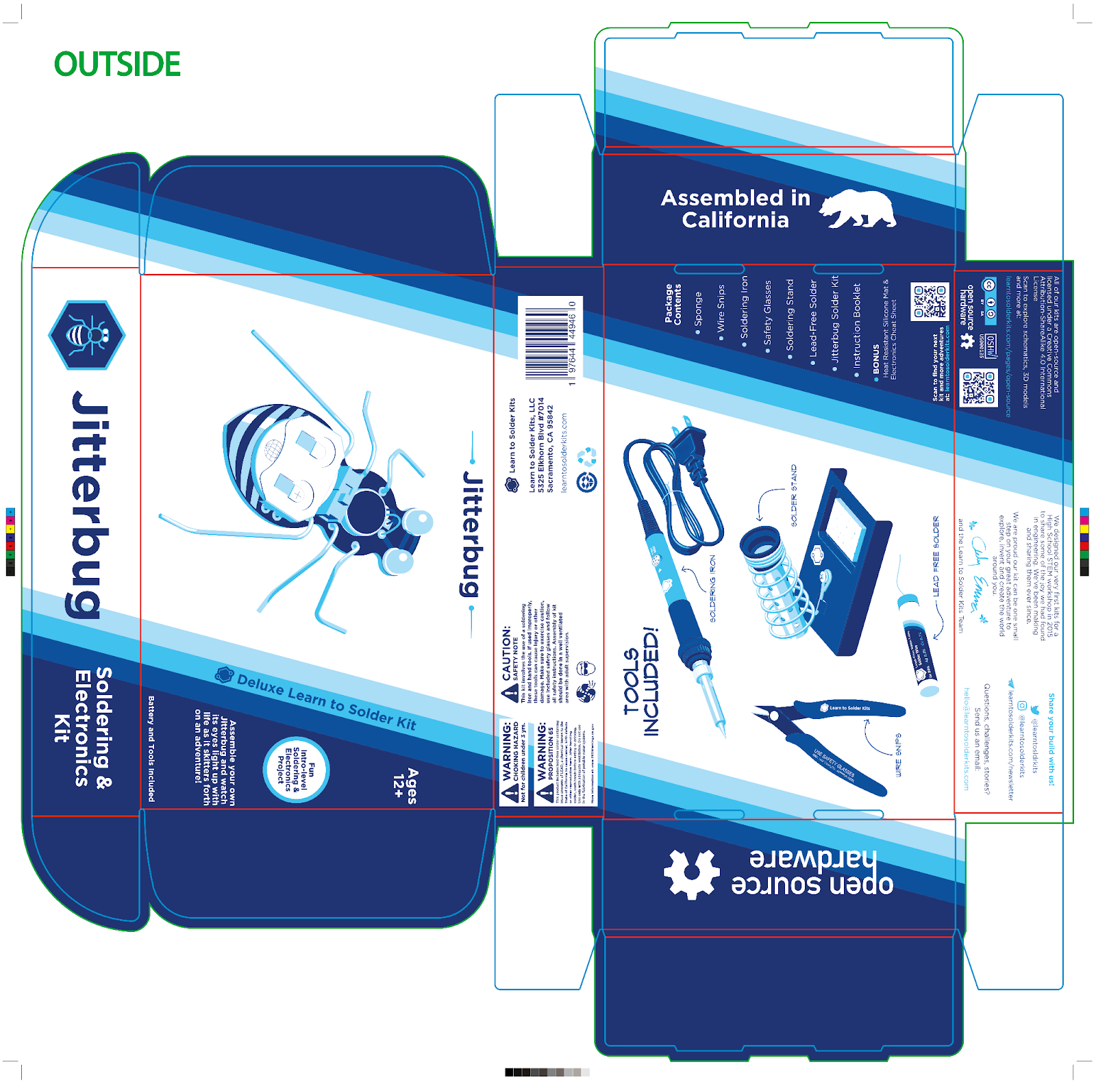
Under the front flap there is a small space that is only visible when the box is open. Here we decided to write a private note from us to the customer receiving our kit. Our employees Kim and Jimena had taken to calling themselves the “busy bees” around then and had started signing their emails with bee emojis. They had even bought Emma a bee themed cake for her birthday. So I added our signatures and some bees fluttering around for them as a surprise for Kim and Jimena. I figured they would mean nothing to the person opening the box but would mean something to the person packing it.
We get our boxes made by West Coast Paper (WCP Solutions).
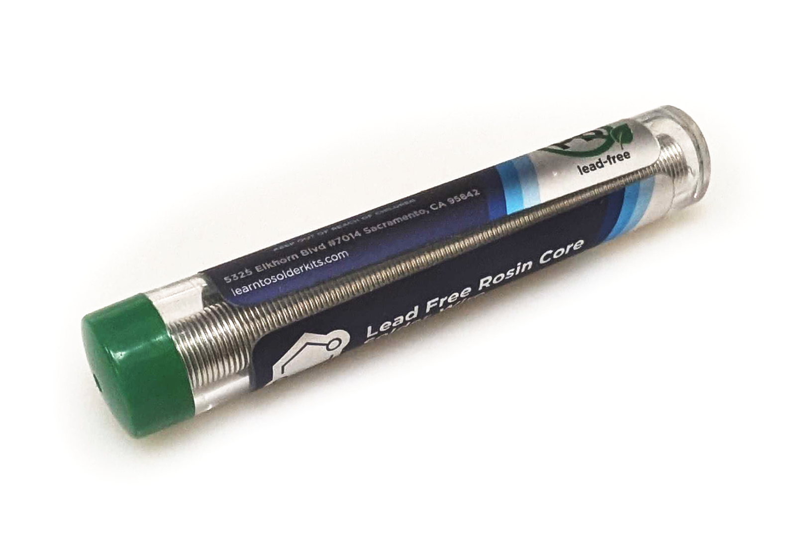
Solder Tubes
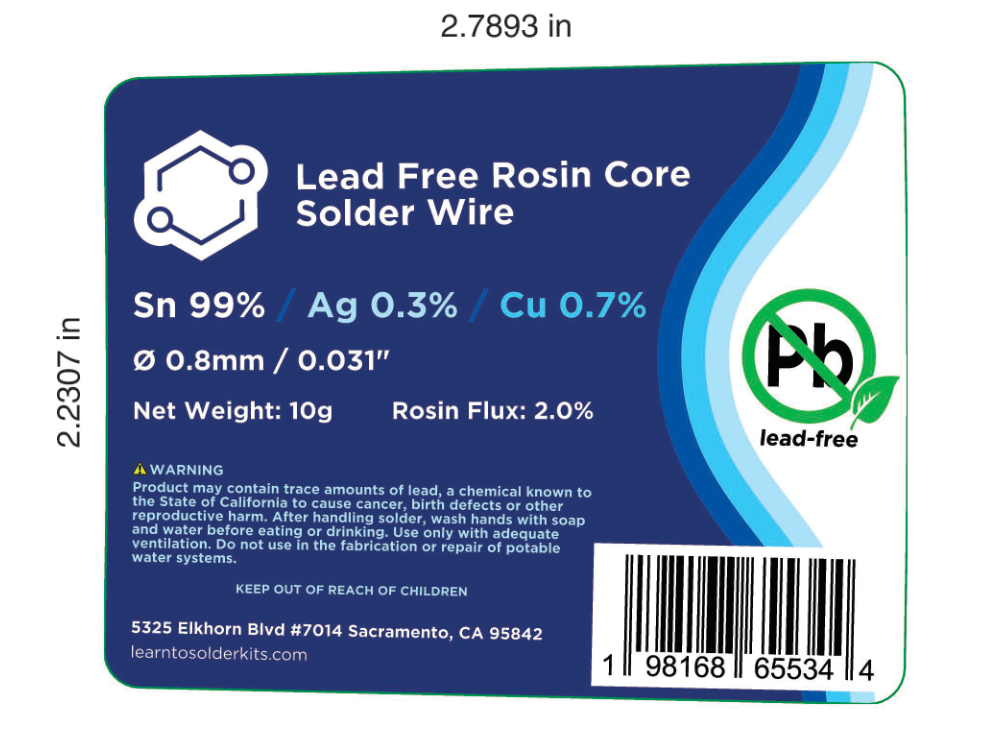
I have previously been very skeptical of lead-free solder but we decided if we wanted a product that could sit comfortably on the shelves in a bookstore or science museum, it needed to be lead-free. I tried quite a few until I found one I really loved, and that we could get sourced without any branding.
Lead-free solder it turns out, still has a minuscule amount of lead. Our solder has roughly 40ppm - you’re allowed to have up to 2500ppm (0.25%) lead in plumbing for drinking water, so this amount is pretty harmless. But having anything detectable meant we were required to put a slightly confusing Prop65 warning on the label to warn of the lead in our lead-free solder. Leaded solder, which usually has about 40% lead (400,000ppm) gets this exact same warning.
I’m glad that they’re trying. But when basically every product gets the same label and there’s no indication of relative risk, the warning label kinda stops meaning anything.
We got a Safety Data Sheet (SDS) made and I designed a label. We ordered about 500 to start from Wizardlabels.com and we quickly discovered a few things.
First, the labels arrived with a matte metallic finish by mistake due to a mix-up at the printer. But this ended up making the labels look much nicer than I had imagined. We decided we’d order all future labels with the metallic finish.
Second, we learned the tube was ever so slightly tapered, something we hadn’t noticed before. This caused the label to leave an awkward, uneven gap when applied - ugh.
And last, we found the labels were fairly difficult and time-consuming to apply manually.
To solve the taper issue, I carefully measured the tube and then redesigned the label with a slight curve, similar to one of those insulating sleeves they have at coffee shops.
With the taper issue fixed, they actually became a lot easier to line up manually, but this process was still rather slow. I went investigating how others solved similar problems.
I found a guy named Jeff in Wisconsin who had developed his own clever 3D Printed labeler machine - The Label Slayer, initially for labeling bottles of maple syrup for his side business. I messaged him. It turned out he was an electrical engineer with three kids of soldering age. He also has another maple syrup related side business making various IoT maple syrup collection sensors - cool guy.
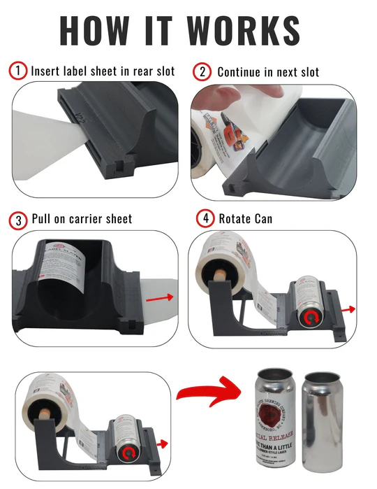
We sent them a care package of soldering kits, and he sent back maple syrup and CAD files for a label slayer.
Silicone Mat
Emma and I (mostly Emma), in the years before Covid would periodically teach soldering workshops at our local makerspace and with community organizations. In that process, Emma put together little travel kits, each with much the same set of items that we were now including in our Deluxe Kit.
One thing she learned was that if you didn’t provide something to protect the tables, you were likely to end up with scorch marks on the furniture of whatever venue was kind enough to host a soldering workshop. So she packed every student a silicone baking mat.
I went to source some for our Deluxe Kit and I learned I could get them branded with our logo - sweet. But then I thought, “what else can we print on them?”
The type Emma used felt a little sticky and static-y and tended to collect dust. These were the style shown above with a layer of fiberglass inside. It turned out pure silicone mats had none of those problems and I was able to find a bunch of companies which specialized in printing them in full color.
All of these places I initially found focused on “dab mats” for weed, mostly featuring unlicensed, sometimes poorly drawn Rick and Morty artwork. ¯\_(ツ)_/¯


I ordered a couple but, while they claimed to be very heat resistant, we found the color didn’t hold up when you dropped a soldering iron on them. I looked more and we eventually found a company that molded silicone for food and baby products that could print a temperature resistant artwork up to 700°F. I spent a few days modeling little components and designing some artwork.

Our mat includes resistor color codes, Ohm's law, information on common circuit components, and how to use a breadboard. I wanted to add a little more, but the mat had to be sized to fit in the box.
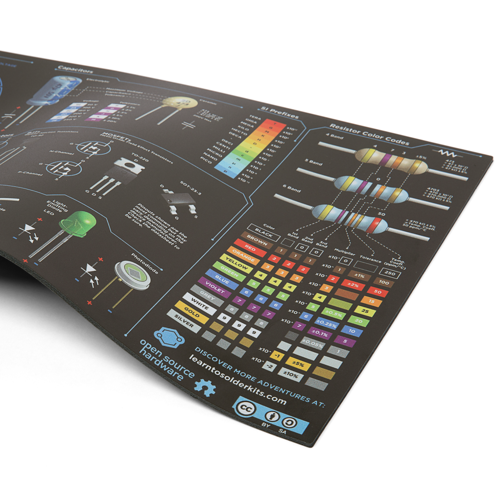
The design was inspired in part by Joseph Ricafort's TinkrPostr series. He lives somewhere in the rural Phillipines. We sent him a Deluxe Kit which he used to help teach his mom to solder.
Instructions
We had existing instruction sets each of our kits already but they weren't quite formatted quite to be made into a printed booklet. It seemed a good time for a refresh, allowing us to add soldering tips and tricks, safety warnings, circuit schematics, debugging issues, and the like.
The instructions were pretty fun to throw together. I took some inspiration from the wonderful, hand drawn Soldering is Easy pamphlet. The instructions were made as step-by-step shop drawings in Onshape before importing them into Affinity Publisher to change the fonts, add helpful arrows, etc.
For these we went with an online printer, Smartpress out of Minnesota to create a set of saddle-stitched notebooks.
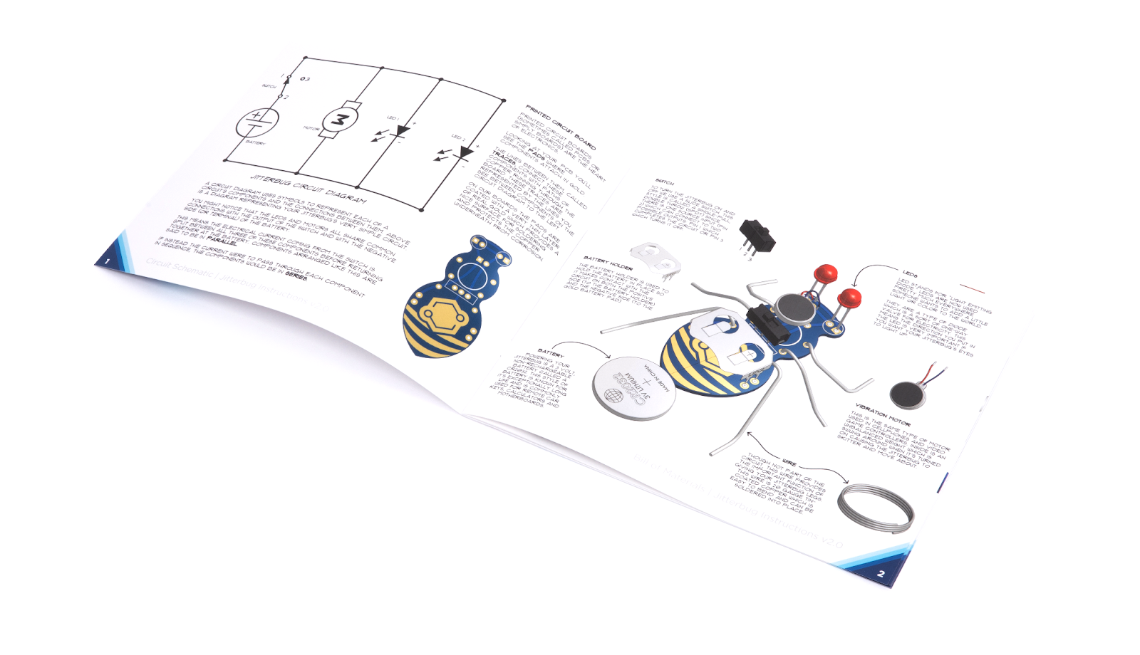
I tried to write these new instructions with a little bit of joy, humor and a spirit of anarchy - which of necessity has to be a part of any creative endeavor.
We’ve been playing around and continuing to update them with every print run.
What I want to communicate is that design isn't something that's done alone in a room. It's usually never even "done." Design is collaborative. It involves push and pull, balancing what can be feasibly done, what's worth doing, whether a choice serves a few customers perfectly or many more well.
Design usually comes down to what, at the moment, is the best way you know how to make something to serve your people best.